#unique visual style
Explore tagged Tumblr posts
Text
1K GIGI Prompts Collections 'Giraffe in Sunglasses: Playful Vibrant Art' 5767 Free 10 pages out of 1000 pages
Get Free 10 pages MTMEVE00548G_25_0001 – 1K GIGI Prompts Collections – Giraffe in Sunglasses, Playful Vibrant Art 5767 10PagesDownload 1K GIGI Prompts Collections ‘Giraffe in Sunglasses: Playful Vibrant Art’ 5767 series provides two documents, one document is 10 pages of prompts in 1000 pages, available for free download. One document is the complete 1000 pages of prompts, this is a paid…
#blue hoodie#bright yellow background#brown and white spots#creative composition#giraffe central figure#orange paint splash#playful atmosphere#realism and cartoon blend#red sunglasses frames#unique visual style#vibrant illustration
0 notes
Text

Been seeing so many cool Clickies on my dashboard since getting into GGG, I just had to take the time to draw a few of them- plus, it was a bit of a challenge to try new styles. A lot of these guys were also super influential to how I draw and even think about Click Clack on my own time, so you should definitely check them out! Names below the cut cus it got long heehoo
Top left: @malartsorte
Top middle (holding papers): @scribblelimbo
Top right: @wishgraanted
Leftmost middle: @beastwhimsy
Middle (peace sign!): @sootnuki
Rightmost middle: @molabuddy
Bottom left: @pespillo
Bottom middle: @artuurle
Bottom right: @modmad
I know I said it already, but all of yall are super cool and I had a lot of fun challenging myself to make this! Keep on being awesome 👍
#ggg#great god grove#click clack#my art#genuinely some of you guys completely changed how i interpret click clack. for real#both visually yes but also like#as a character.#special shoutout to malartsorte and modmad for being huge influences on my headcanons#a lot of stuff yall brought up was stuff i never even considered. its cool#beastwhimsy has always been a huge inspiration for my art style and is one of the reasons i gave ggg a try#in the first place#and ur click is so cuuute and awesome and was the first insp i remember seeing of bnuuy click. changed me#graant's fic holds a VERY special place in my heart its so good. and your take on click clack is so fucking unique and phenomenal#as much as your writing is#pespillo has such a fuckin cute click (and thesp) and has really neat takes ive delighted in reading#SOOTNUKI has been a huge insp for a lot of thangs and also just a delight to see art from. i get so happy every time i see one of ur guys#crossing my dash#marc. points at you. i fuckin love ur click hes so awesome#sophies art is so fucking pleasing and helps remind me that he is cartoony cus i tend to drift towards the realism side#and then i see ur stuff and go wait. cartoony stuff is so pleasing and fun. and i do it and have fun!!!!!!!#and artuurle. duude idk all of your stuff is fucking phenomenal. every time i see a post from you i get so excited#both your art and aus and headcanons and everything is all so so so delightful#im so glad to be able to see so many cool artists doing cool things#wow i rambled a lot in here. uh. if youre reading this still. sorry(?)#have a nice day
329 notes
·
View notes
Photo

Eyewear Collage from (un)fashion - An array of individuals showcase their distinctive eyewear, blending cultural nuances with bold style statements.
#white#portrait#brown#global style#cultural diversity#red#1990s#visual identity#fashion#unique eyewear#photography
109 notes
·
View notes
Text
youtube
My Masters short film, "Beast King and Queen" is finally live, please give it a watch.
twt / store
#masterpiec#i actually idk what else to say here#i truly tried to make it something unique to myself in themes and visuals and narrative style#Youtube
355 notes
·
View notes
Text
so invested in my thoughts about trans hiccup right now that in the span of one night i’ve:
Written more of my httyd au/retelling where hiccup gets taken with valka and then separated from BOTH his parents and somehow manages to find his way back to berk anyway
Drawn 4 pages of a comic exploring t4t hiccstrid with probably 8 more pages to go
Started a whole other wip fic exploring tgirl hiccup during rtte-era (which i literally haven’t even finished watching)
and so in honor of my lack of self control and especially in light of point 3… here’s tgirl hiccup U_U
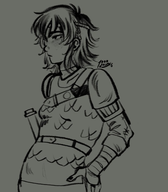
#my art#art#httyd#how to train your dragon#hiccup horrendous haddock iii#hiccup haddock#trans hiccup#:B like what can i even say.#i was struck so strongly by the visual of hiccup wearing valka’s kransen and walking around with astrid’s braids.#her swag: OFF THE CHARTS#also the braids on the side of her head are from stoick!!!!!#i headcanon that each clan has their own unique braiding style#so here stoick has done the traditional haddock braids for hiccup since her hair is long enough#imcrying. if you see me posting on ao3 after a year long hiatus its because my thoughts got to me#gothi let’s get this girl on estrogen#em.txt
138 notes
·
View notes
Text
after further review I have concluded that HTTYD 1 is actually the best out of the trilogy, not HTTYD 2
#httyd 1 has the best story httyd 2 has the best visuals httyd 3 exists I guess#my biggest issues with 2 is pacing copycat alpha dragon and the villain is 2 generic#3 has a better villain but I just didnt care by that point like you know they're gonna be fine idk you know he doesn't matter#but in 2 like...stoick reunites with valka and then dies 10min after there's 0 room to breathe#toothless in 2 is just reduced to transportation dog#3 had so much potential with the hidden world glowing stuff to only give us 5min of it...sad#the style from httyd 1 is so unique and ugly but charming and by 3 its smooth Disneyfied faces#Astrid turns into an Elsa knock-off#ok rant over good night#httyd
122 notes
·
View notes
Text

World of Horror
It’s been six years since WORLD OF HORROR first showed up on itchio. It eventually got picked up by a publisher and entered early access in 2020, where it was worked on here and there by panstasz while he was doing IRL dentist work, well off the original planned schedule. The wait was well worth it, though, as the complete 1.0 version is now done and the game has left early access, showing a ton of polish compared to the 2020 version, and is almost unrecognizable to the 2017 early build from way back when.
Read more...
#world of horror#panstasz#ysbred games#playism#anime style#urban setting#horror#roguelike#western rpg#unique visuals#nintendo switch#playstation 4#playstation 5#microsoft windows#hardcore gaming 101#jonathan kaharl#review#video games#indie games#pc games
37 notes
·
View notes
Text


A little glam, a little sweet.
~
Finding your own unique art style as an artist is hard, so I’ve done some experimenting and I think I’ve finally founded my two!
If I was to describe my visual style, it would be very UPA and clean crayon “kid’s illustration” inspired. If I were to use texture, it would be a blend of real-life and digital illustration but I’m not sure what I would call it?
Collage? Texture? Collage or texture fused with digital art? What would you call this art style?
Le me know below ⬇️
#pink aesthetic#pink#pinkcore#pink art#pastel pink#dessert#dessert art#sweets#makeup#digital illustration#art style#beginner artist#amateur artist#food art#artists on tumblr#collage art#collage#texture art#visual design#graphic design#art design#unique art#clipart#illustration#girl art#cupcakes#digital art#crayon art#crayon#adobe illustrator
12 notes
·
View notes
Text
it's so funny how movies, televison, and video games all have the issue of "we are so focused on things looking the best as possible that we sideline sound design, art direction, and style in favor of what looks like it could be most visually realistic to real life"
#was replaying the original resident evil 4 and like I do enjoy the remake and think the remake does look visually and audially#the original just feels better with its character design and art style and soundtrack and sound design#like the remake looks realistic but it also looks less of its own world#i saw a video of monster hunter and didn't even know it was monster hunter but guessed it had to be#because it literally looked just like resident evil 4 remake but I knew it wasn't and that was like the only other option#same could be said of the soundtracks I feel the newer resident evil games sound more generic#love the older soundtracks. but it could also be that I didn't grow up with those games#so they sound more unique to me
13 notes
·
View notes
Text
hitting this article with a rolled up newspaper. bad. stop it

sigh. exhaustive argument that none of these shows grouped together have the same art style below, complete with images and whatever
oh also im not the type to comment on articles so idk the etiquette but don't like. go over there and say "ur list sucks >:P" that's just gonna bring more traffic to it. i linked it so people could ratio me if need be not so that you guys could dunk on this random listicle writer. it's pointless and kind of cruel. just so we're clear on that
edit: the quote above uses "time period" instead of "era". i quote it as saying "era" a lot. i'm not fixing that
note: here i'm assuming "art style" refers to, generally: character designs (facial and body proportions, how things like hair is dealt with, etc), lighting, color (palette, saturation, value), line weight, etc [and mostly excluding things like shot composition, direction, etc because while those probably count my personal experience with these shows is mostly limited, and because most people focus on the previous things i've listed in their discussions of art styles. the analysis within the article is incredibly shallow, and if they think samurai champloo's art style is "rehashed and reused", i don't think they're like. super deep in the art analysis sauce. anyway]
code geass vs death note. what are you saying. what are you talking about


code geass' approach to color is more vibrant, and dn's is more washed out. dn takes a more realistic approach to faces and bodies, both in proportion and in shape (namely how curved their features are (as opposed to cg's far more exaggerated sharp faces, large eyes, and lanky bodies. note how lelouch's lips barely jut out in profile, for instance)). i shouldn't have to explain this they're not even close
that's the most extreme example, but samurai champloo and cowboy bebop aren't That similar either


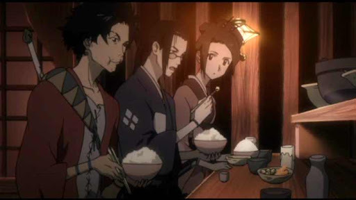


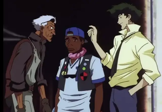

it's hard for me to speak on bebop for the most part because i've never seen it (vs my ~8 eps of samurai champloo knowledge), but from what i have seen, bebop often has a sort of delicate intricacy to a lot of its linework (especially its backgrounds) that champloo tends to sacrifice in favor of bolder lines and higher contrast. it was hard to find great examples, but the silhouettes champloo's characters cut are often sort of.. choppy and wild, and usually lanky and stretched-out, while bebop's are more realistic (focus on the shoulders in the last image set, for instance). there's overlap, sure, but there are clear and intentional differences in the designs, to say nothing of champloo's higher saturation and the natural differences between hand-drawn and digitally-drawn animation
(and if "art style" is referring to the direction rather than just character design, lighting, color, etc, it's because these two have the same director, which hardly creates an "era". that's like comparing two miyazaki films from the 90s and saying "this is what 90s anime movies looked like", it's nonsense. also, i feel like lumping these two together because they look a little similar is unfair because they're pretty unique from their contemporaries in their own right. they may resemble each other a bit, but how much do they resemble other late 90s early 00s sci-fi/historical anime? does samurai champloo look like outlaw star to you? or trigun? or evangelion? does cowboy bebop look like ninja scroll? or samurai 7? or sword of the stranger? etc etc etc?? if we're claiming that cowboy bebop and samurai champloo share an "era", then what of their contemporaries, and what about differences across bebop and champloo's very different genres? more on this point later)
even fruits basket and ouran, the ones i initially felt were most similar, have clear distinctions

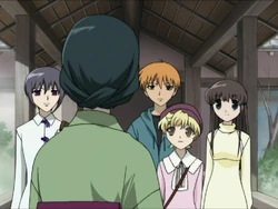
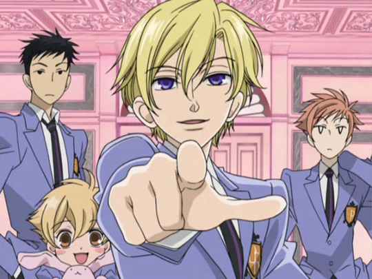

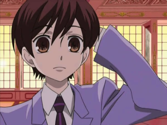


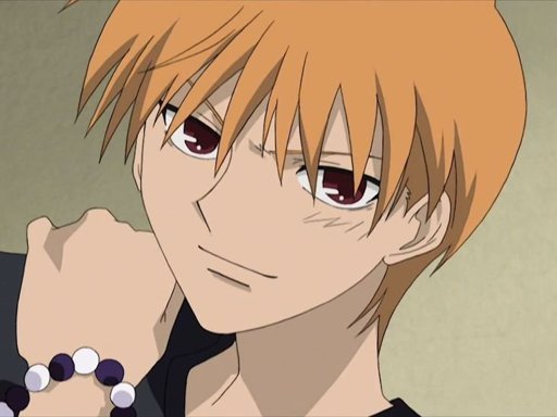

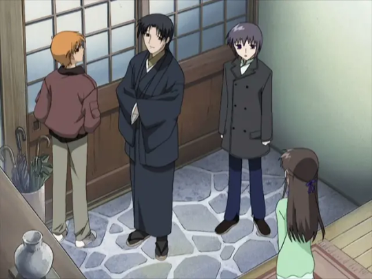
ouran's got a distinct abundance of pastels in its color palette, tending towards pinks, blues, yellows, oranges, etc. its use of black and brown is very limited. fb's palette is a bit more relaxed, and while its colors are often pale, i wouldn't call them pastel (they also skew more towards natural, earthy tones). fb's characters have noticably.. flatter skulls? in some shots, and their heads are so squat that they can seem consumed by their eyes. anyway this is a trait ouran does not quite share, for a number of small reasons, like how their cheeks bow out, greater emphasis on noses and mouths, and its use of highly variable line weight (vs fb's very stable line weight). hair is more voluminous and multilayered in ouran, and features like lips and noses (esp noses) are fuller, more three dimensional (in general, ouran's approach to shading hair and faces makes the characters feel rounder). the sharp edges and bell-sleeves of ouran's uniform blazers are actually far more reminiscent of the designs in code geass than fruits basket, imo. (actually.. i'm not sure how to express this but a lot of the poses in ouran resemble code geass poses, in their locked-joint arms-stretched kinda way). ouran forgoes hair-shine, while fruit's basket adds them in either jagged points (see most of the images i included) or a sort of triangle wrapping around the head (not pictured here, just trust me)
(note: i'm assuming they are referring to the 2001 anime adaptation of fruits basket rather than the 2019 one, because not only does the 2019 adaptation resemble ohshc even less, but because they are closer in time period, and the grouping is supposedly based on era).
my point is none of these shows look rehashed from one another. there's sometimes overlap, but each has a unique aesthetic based in many small choices made in their design.
now let's look at their use of "eras" a little more. this is the timeline of air dates for the first episodes of the six shows mentioned (for their original japanese runs, obviously):
cowboy bebop, april 1998
fruits basket, july 2001
samurai champloo, may 2004
ouran high school host club, april 2006
code geass, october 2006
death note, october 2006
code geass and death note being paired by era is, at least, accurate. same month, same year. it's about as close as one can get. however, the other two groups are far more removed from each other. fruits basket and ouran have five years between them, and bebop and champloo have six. this wouldn't be such an issue if there weren't other anime within this list that came between them. if bebop and champloo are in the same era, why is fruits basket grouped differently? ouran came out in 2006 just like code geass and death note, so why is it grouped with something that came out five years prior instead of them?
i think it's fair to say that eras are not purely chronological, that there's overlap between them. one doesn't begin as soon as (and not a moment before) its singular predecessor ends. but era feels like an incomplete distinction here. this list alone shows quite a lot of variety for what someone can mean when they say something "looks like 2000s anime". most anime fans have a picture in their head of that, and, to be so honest, i don't think samurai champloo is it. using only time as a distinction rather than movement, genre, etc is simply not enough. the fact that 5/6 of these shows occur within 2001-2006, and yet they're set apart into three different eras, and each pair (in ways i'm sure the author of this piece would admit) does not resemble the other, is proof enough that 2001-2006 did not have one repetitive art style, at least not in a way these anime exemplify. that's to say nothing of whether or not the anime within the era-pairs look the same, which we've established i don't. but since they don't actually tell us what their eras are, we can only speculate. personally, i speculate that they didn't think about it too hard at all, or even look up the release dates, going off vibes instead, if that.
when this person is talking about "eras", i think "eras within certain styles or genres" is more accurate, but even with these in mind, matching shows up like this makes a lot less sense than i think they realize. death note and code geass are sometimes lumped together because they're both mind-gamey thrillers with megalomaniacal protagonists with a single unique power that they use to try and fix/control the world, not because of their art styles. trying to say they look the same just because they share plot elements and came out around the same time is just... really weird. fruits basket and ouran both fall into early 2000s shojo, which is part of why the comparison fits more. target demographics and what magazines cater to those demographics (and thus the aesthetics of those magazines, which you have to fit into enough to get your manga published, and which also just influence what you want, what readers want, etc through exposure) (<- oversimplifying) are an actual valid point of comparison, at least more so than "idk 2006 lol". even if the result is more like "romcom for girls, 2006"
it doesn't help that many of the choices they made for unique art styles don't feel particularly "unique" to me.


choices like mononoke and land of the lustrous i get. and i'm not saying any of the examples i've just pulled or in the article are bad art styles, or that they don't bring anything unique to the table. i'm sure many of them are beautiful, and help elevate the tones of the stories, and all that jazz, whatever. but if the name of the game is "unique", then i don't think these cut it from what i can see. it doesn't help that most of the analysis comes down to "it looks really really cool" or "you don't normally see this art style with this genre/tone" (which is not the same thing as being broadly unique, imo)
it could be that we have different impressions of what "art style" means. it could lie somewhere in the bits of art style that i cut out, like shot composition and direction, etc. and some of it is probably a difference in what constitutes uniqueness, both between our differing experiences with media and personal taste/philosophy. but i don't think i'm wrong here when i say that the assertion that samurai champloo is era-typical in a way that beyond the boundary (2013) isn't is just fucking wrong.
look i know that bit that i screenshotted that started all this was a filler paragraph. i know it was the mandatory setup for the listicle you scroll to immediately, the parts you're supposed to ignore. i usually ignore articles like this completely because they're kinda bullshit. but i think this hunt for what looks the most unique is a flawed and confused one, at least to some extent. especially when all of the justifications are like "it supports the vibe well", which is something that all art styles are supposed to do, no matter how "unique" they are or are not, and i think that when people discuss things like art styles and anime and what looks generic and what looks unique, lumping things together too much often removes the nuances that really do influence people. i'm an artist. it's gonna sound dumb, but the way things look matters to me, even if it's stuff like how shirtsleeves or noses are drawn. to ignore all these little differences that make each piece unique is to blend so many singular, unique things into this easy-to-categorize mush that just... does a disservice to the choices every artist makes, i think. even if it is a pretty mild disservice. again, i cannot stress enough that this article is not important, and that this post responding to it is also not important.
look, what i'm trying to say is stop and smell the roses. notice the differences in the art you consume and think about it. looking for something that's so different it jerks your brain around is cool and good and fine and normal, but to disregard things as "basically the same as xyz" is reductive and icky and i don't like it. if you want something unique idk go watch kaiba (2006) have fun it's really good. i'm going to bed
nvm miscellaneous gripes section + i go to bed at like 5am lol i LIED:
the only thing said about beyond the boundary's art style is "it's hard not to fall in love with the art style", and the rest of the comments are other elements. that's too vague! i'm docking points!!
a lot of this seems based in the color palette now that i'm rereading it. not that my analysis doesn't also involve that, and not that that's invalid, but it makes me think there uh. might not have been Too too much thought beyond that. (example: "Though the dark and cool colors provide a sense of dullness, these colors cater to the tone of the story, which is dark and representative of its heavy content." like. that's not. unique. that's not unique to solo leveling y'know to have a dark story be awash in dark and cool colors that's pretty normal actually. maybe how they do it is unique, but we'll never know bc i haven't seen solo leveling and the author didn't care to elaborate :/ oh well)
this one's petty but i actually think ohshc's art style is pretty unique. maybe it's just because i've seen it several times and certain details like how the bottom-lip-to-chin shadow is done have caught my attention but like. pouting crossing my arms huffing >:( i think it's unique wth...
demon slayer's an alright choice i agree. idk i barely watched it a few years ago and it still wrenched my art style in a new direction. i dunno anything that looks quite like it. i'm not mad about all these choices per se it's just hard to whittle something like uniqueness down to a top ten list, i guess. and to say samurai champloo's generic while violet evergarden is the 5th most unique anime you've ever seen is like. weird. you're setting yourself up for people to go ehhhh... idk...... if you're not picking stuff that's like. Clearly Out There (i.e. mononoke)
"It’s no surprise that Demon Slayer is an anime with some of the best art styles." i might be fighting something that was written by ai now that i think about it...
oh god this was totally written by ai. or it went very unedited. man i spent like 2 hours on this (<- LOSER LOSER). they can't decide what the plural of anime is
they insist that chainsaw man's art style is weird enough to maybe put people off, and the only reason i can think that is is bc it's cg. but don't do the same for land of the lustrous, which is also and much more obviously cg. idk
they phoned it in but didn't even include that ping pong anime smhing my head. y'know the one everyone includes. which means whoever wrote this actually did stick to personal choices over crowd-pleasers, or chatgpt goofed or whatever. idc. guys they didn't even put flcl (<- but they put gurren lagann? as a gurren lagann fan im confused) oh my godd
ik i said this before but im saying it again: a lot of their pros and cons come down to whether or not an art style is typical for that kind of story, so like whether something gritty in tone has a more realistic art style or whether it has something visually cutesy instead. art style is more than just those things, but even that analysis is like. pretty much as bare-bones as what i just said. yucky
oh also part of my issue with this (didn't phrase it right sorry) is like. "unique" is a broad term. a really broad term. it can mean anything. there is no top 10 anime with unique art styles article that would escape that problem, and my analysis here does not escape that problem. i find the term a little unproductive (same with the concept of "originality"), so just know that i guess
#this doesn't even go into things like shows with variable art styles. yu yu hakusho cycles through storyboarders in a very obvious way#and jojo's bizarre adventure's art style adjusts for every part (creating a sort of average for the gradual shifts in araki's style over th#course of that part). and that's off the top of my head i'm not even like a big boy weeb y'know#listen take all of this with a grain of salt i haven't watched any of these all the way through (minus ouran) and some of them i haven't#watched at all. but a lot of this is evident from just Looking at stills and footage bc it's a visual thing. that's gotta count for smth#at the very least i'm confident that my analysis is um. better than the person who wrote this's analysis. so yeah#i'll have to think more about the difference between something being overall unique and unique in application to smth else because im....#not 100% settled on the idea that one is the True Meaning Of Unique. again part of my problem with this is the oversimplification of unique#the concept y'know so like. whatever#noticing more differences. ouran includes the nose bridge/beginnings of a brow more than the middle line of a nose or a sole dot like fb
9 notes
·
View notes
Text
I swear I’m not a hater for modern and/or digital anime, especially not with the many times I’ve defended new getters art style but MAAAAN why is casshern sins visually so much better looking then most recent digital animes? Like the art style probably isn’t for everyone given it’s still kinda bug eye/same face syndrome-y but even the faces are still different from how most of them do it. And the colors and the line art… they blend beautifully together that even if it’s clear it’s digital it has this painted feel to it.
Why can’t more new animes try to be this unique with its art style 😭
#meg text#casshern sins#I could unironically write a paragraphs worth on how well sins uses colors- like it nails how it uses colors for visual storytelling so wel#and obviously not every anime or animated thing needs a specific reason for its line art or color palette#but I WISH more that are trying to tell stories would do what it does#like this was 2008 and yet it feels more creative in its style then others#I hate to dickride but it’s such a fucking unique art style#I want to try to replicate it even if I barely understand how to do colors
9 notes
·
View notes
Note
No but like. You have a point with the credits. It just comes off as lazy. My guy, the Buffy the Vampire Slayer spinoff had it's own opening and probably didn't have a crumb of budget compared to hotd
Oh my god that comparison is perfect to what my point was, you are a genius
The theme song to Angel is so good, it's not as much of a banger as Buffy the Vampire Slayer's, but it is great on it's own, and it has it's own unique identity that feels appropriate for the different vibe of the show. So, I really was expecting a different theme song for hotd.
I mean, think of Game of Thrones. The music for Dany's scenes all had a different sort of vibe to it, only twinged slightly depending on whatever city in Essos she was near that had a different culture to explore. And her music was already really good, and I liked that it was very different then say the Stark music or the Lannister music. It made it stand out when you hear it, giving the Targaryean character's music it's own audible Targaryean identity.
I was sort of expecting something along those lines, not just, the same one as the other show. I mean I get it, by using the same theme it connects the two shows together, but like you said, Angel had a different theme then Buffy and it was awesome and I never needed to hear the Buffy theme to remember that I wasn't watching Buffy. I knew it was set in the same universe without the same theme song, because the musical team on that show understood that I was not a one year old who still slaps my hand into my food instead of eating it.
I just really love analyzing the music for Game of Thrones, I think Ramin Djawadi put so much thought and passion into making the music so memorable and distinct. I mean when the Stark theme started to play at the season 2 opener of hotd, I immediately got hit with those feelings because the Starks music is so distinct and holds such an emotion value. So it worked in a very small dose like that to introduce us to the setting we found ourselves suddenly in, but it didn't overstay it's welcome where it got to be too key jangling. It knew there when to pull back, but still, that was the show using Game of Throne's music to it's advantage, it was nothing unique to hotd.
But I really struggle with the music for House of the Dragon. Not a lot of it feels distinct, and I know that most of the story takes place in the same locations with very similar people who do not need distinct music, but there feels like a lack of individuality here. It doesn't stand out, it's not memorable.
The music that plays in season 1 episode 2, when Jon is saying goodbye to Bran at his bedside in front of Catelyn, is actually one of my favourite scores of all time since the first time I ever heard it. It is beautiful and it reminds me of that scene and the Starks everytime I listen to it.
I just think the lack of a unique opening theme for House of the Dragon is indicitive of the show's lack of a musical identity, in comparison to Game of Thrones, which used it's musical scores in such a brilliant way that is rare for a television show.
Also, again to end on a petty note for bad comedy, I still watch seasons 1 through 5 of Game of Thrones and the theme song still makes me excited because the show attached is still up to that music's quality (season 5s quality is only held up by the Jon plot and the Cersei plot I will admit that though).
House of the Dragon is a chore for me to get through, but I'm trying to rewatch season one to be able to better have references directly for some of my future criticsms of the show, and hearing that theme song before these episodes is like, no.
Go get your own theme song, this one doesn't belong to you.
#i at least like the season 2 visuals of the looms of thread heleana was whispering about#its a unique visual style that works better for the show at least#ramin if your reading this#which of course you are why wouldnt you be#make a new theme for hotd stop using the GoT one it offends me and my hyperfixating adhd#also why is your music boring this time around are you not trying are you being held hostage blink twice if you need help#game of thrones#house of the dragon#hotd#hotd critical#anti hotd
11 notes
·
View notes
Photo

✨ Dive into the world of nostalgia with our latest wallpaper design, Timeless Patterns! 🕰️ This captivating wallpaper features a stunning arrangement of antique pocket watches, each one bursting with its own unique character and charm.
The intricate details and textures of these vintage timepieces create a visually striking pattern that perfectly blends the nostalgic vibes of yesteryear with a modern twist. Whether you're looking to add a touch of elegance to your workspace or simply want to embrace the beauty of time, this wallpaper is sure to impress!
Perfect for any room, Timeless Patterns brings a sense of sophistication and style. Just imagine these beautiful watches adorning your walls, reminding you of the precious moments in life. 💫
Ready to transform your space? You can easily enhance your environment by bringing this wallpaper into your home. Check it out and see how it can elevate your decor!
👉 Explore Timeless Patterns and let your walls tell a story!
#wallpapers#patterns#textures#antique#pocket watches#vintage#nostalgia#home decor#interior design#unique#charm#intricate details#modern#elegance#style#sophistication#visual art#decor#artistic#design inspiration
3 notes
·
View notes
Text
part of the fun of poetry recitation is that,
when read "properly" poetry is read straight through, not pausing at lines breaks and visual poems are lost content is elevated over the form.
but in fun style, if you read visual poetry as it's written, it becomes an opportunity for creating an accessible audio description of an otherwise untranscribable element of the poem's form, WHILE in doing so thwarting the content in favor of the form !!!!!
what a heart palpitatingly rich ground for new meaning to take shape!!!!!
#eeeeee!!!!#those poems in the last reblog are my work from my fandom blog#but i just put a monologue from iwtv into new poetic forms and styles#and when i read them to myself as they're written - naming the punctuation (the element that IS the key shift in that version) - it opens u#so much of the meaning#and it would be such a fun way to read a book of poetry with unique forms/visual poems to someone who cannot see the page#like i'm thinking#a version of straight recitation followed by a version of translation of form !!!!!!!!!!!!!!!!!!! i would LOVE to hear that!#bc that's what's missing from poetry collection audio books#when you only get the content you are missing the form#and the form holds just as much information as the words#AAA!#text post#poetry#poetics#visual poetry#recitation#audio description
4 notes
·
View notes
Text
oh my god that ai generated jjk fanfic ending rewrite is so bad holy shit. gege akutami deserves to declare unlimited genocide on usamerican redditors
#not on the ai art evil bandwagon but the comic has that ai slop look that so generic#theres no interesting direction in the visuals or unique style its the most boring art ive ever seen
5 notes
·
View notes
Text

No More Heroes
Goichi “SUDA 51” Suda has gotten a lot of mainstream attention in the past two decades. He’s become one of those weird Japanese developers that embody artistry over mechanical satisfaction, both to amazing ends and frustrating lows. It’s difficult to ignore the guy, nor not have some respect for him, even if you don’t really like what he’s trying to make.
Read more...
#no more heroes#grasshopper manufacture#suda 51#anime style#urban setting#hack and slash#remakes available#unique visuals#wacky#over the top#wii#playstation 3#nintendo switch#hardcore gaming 101#jonathan kaharl#review#video games
11 notes
·
View notes